

An identity in flow.
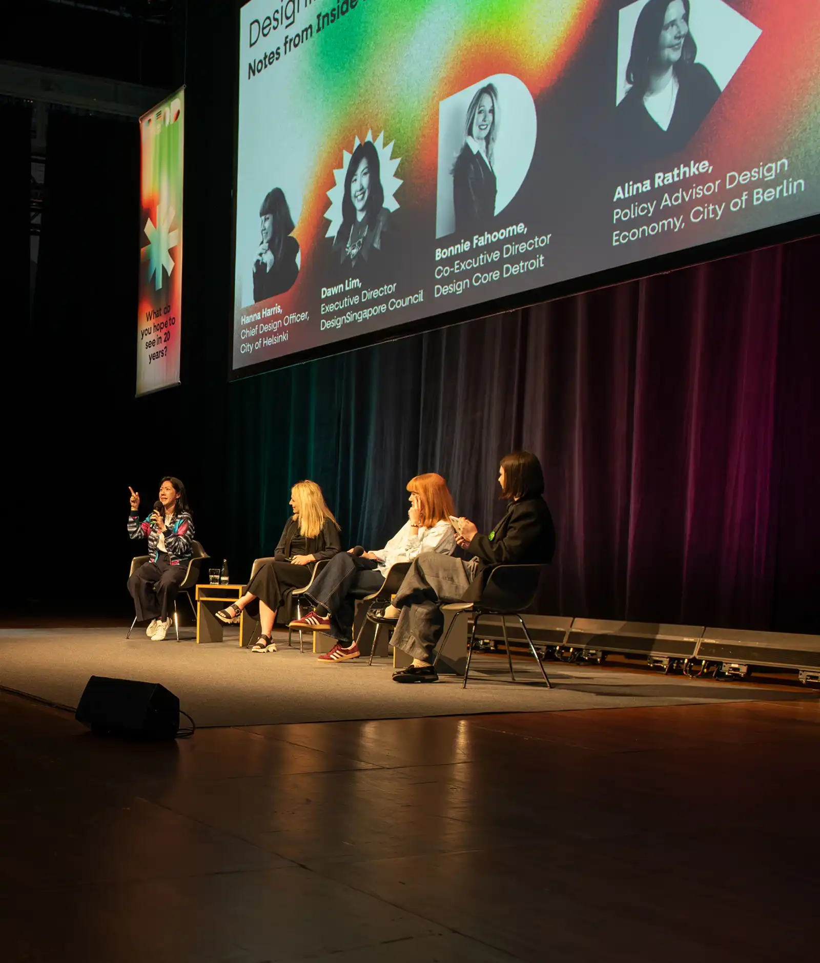
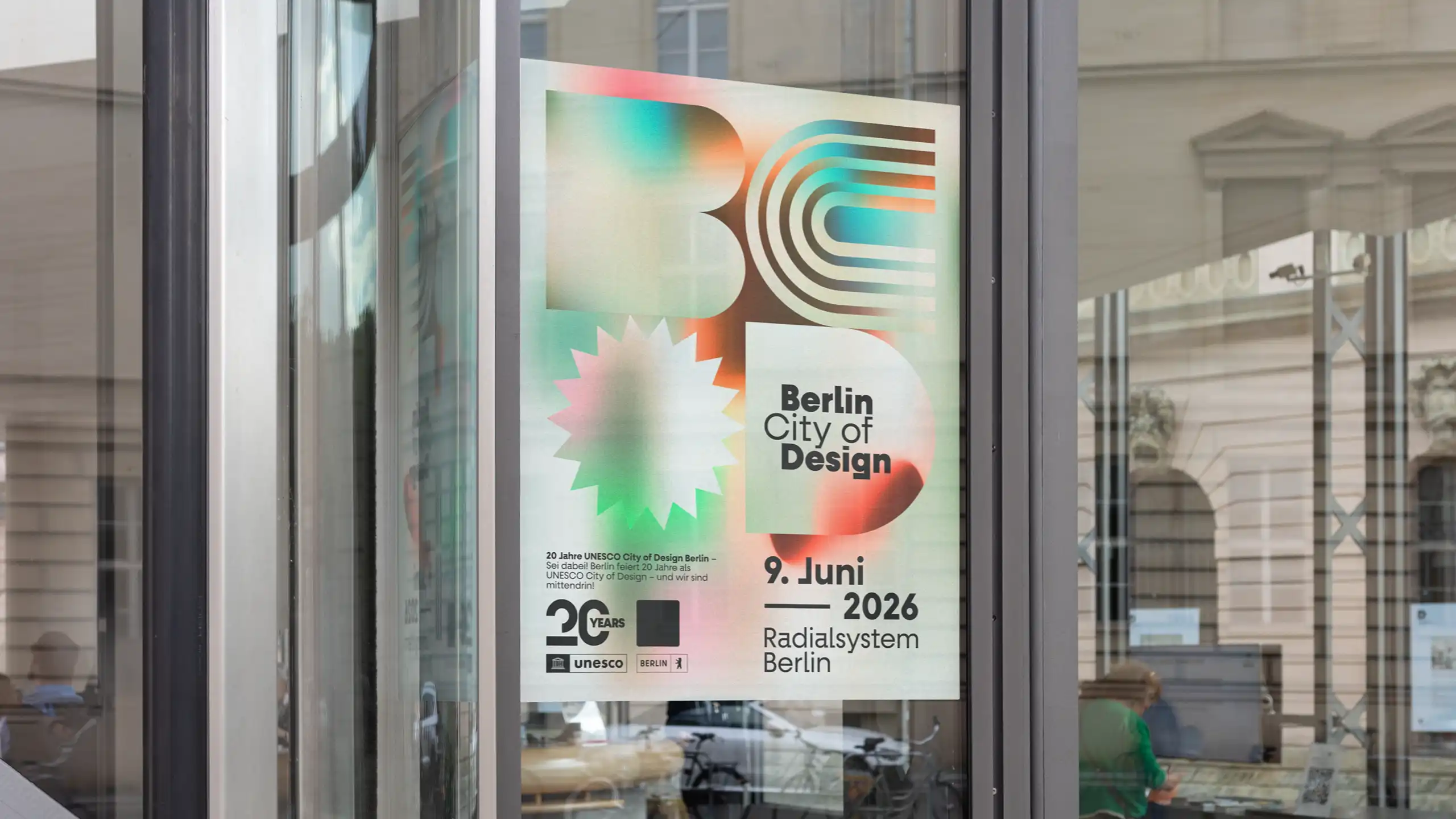
Gradients create a visual language for what defines this city: the permanent blending of diverse people, perspectives, impressions, and stories. Exactly in this openness, friction, and dynamism lies Berlin's special energy, and it is the origin of the idea for the branding.
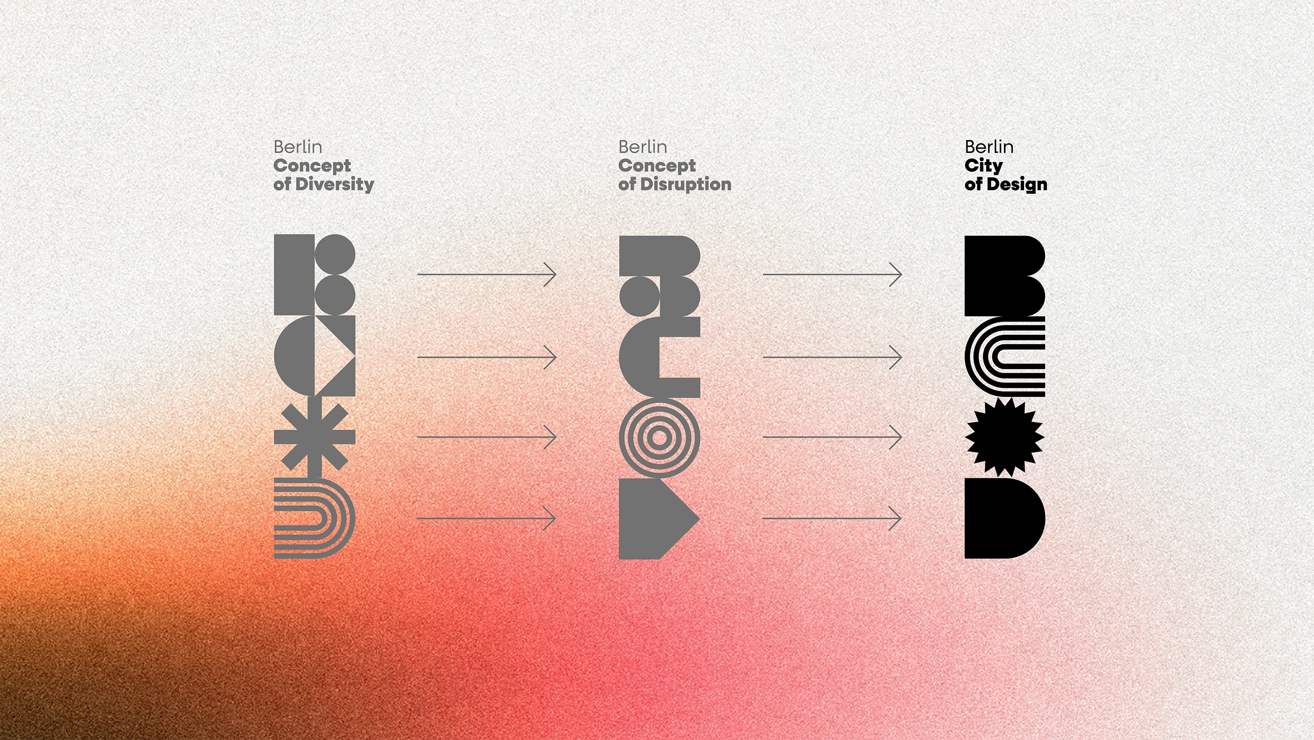
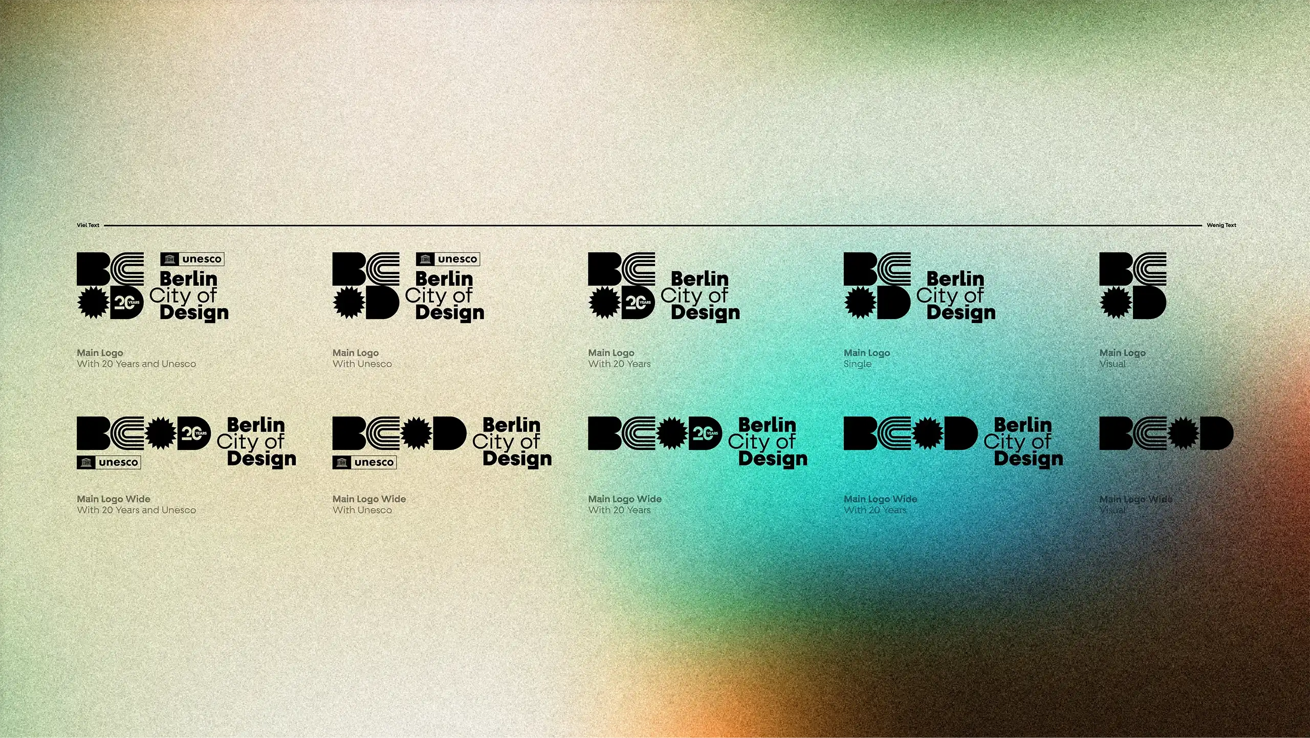
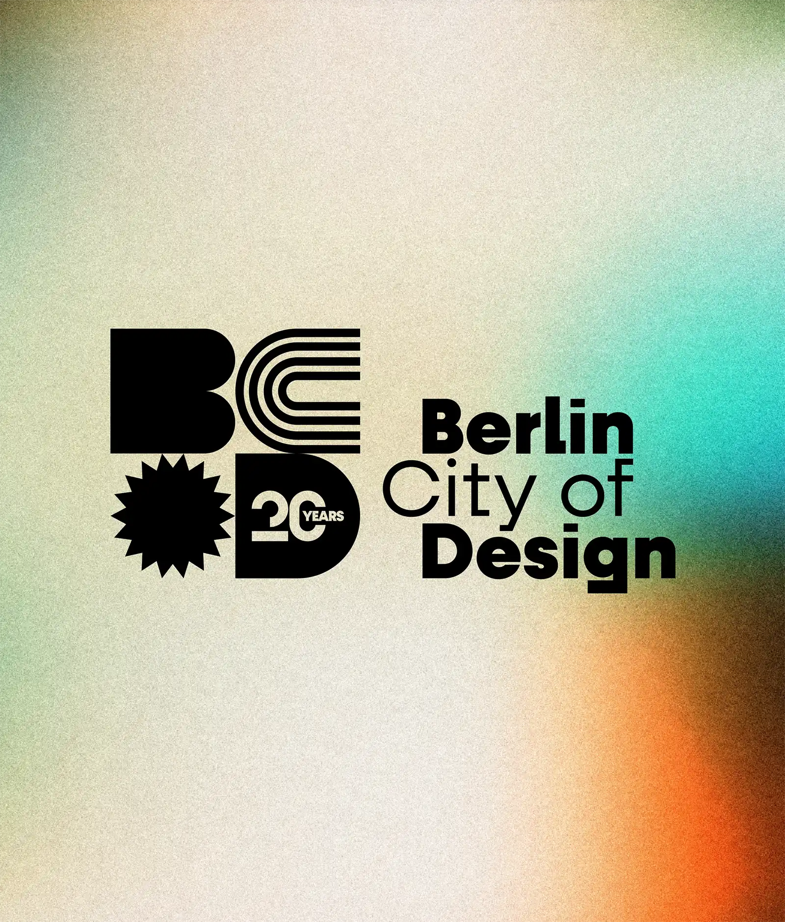
The logo as a flexible
Design System
The logo is derived from basic geometric shapes which, in their simplicity, form the basis of every design—whether in architecture, typography, art, or product design. Two additional geometric shapes are assigned to each letter of the key visual BCOD (Berlin City of Design): they stand for Concept of Diversity and Culture of Disruption, charging the visual with precisely the emotional values that Berlin stands for. In all digital applications, they are constantly in motion: they alternate in an animation until they finally come to rest in the logo.
Floating,
transparent,
in the middle of it.
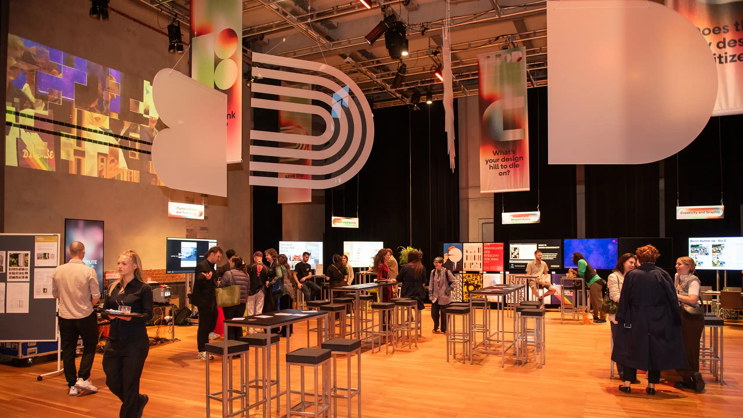
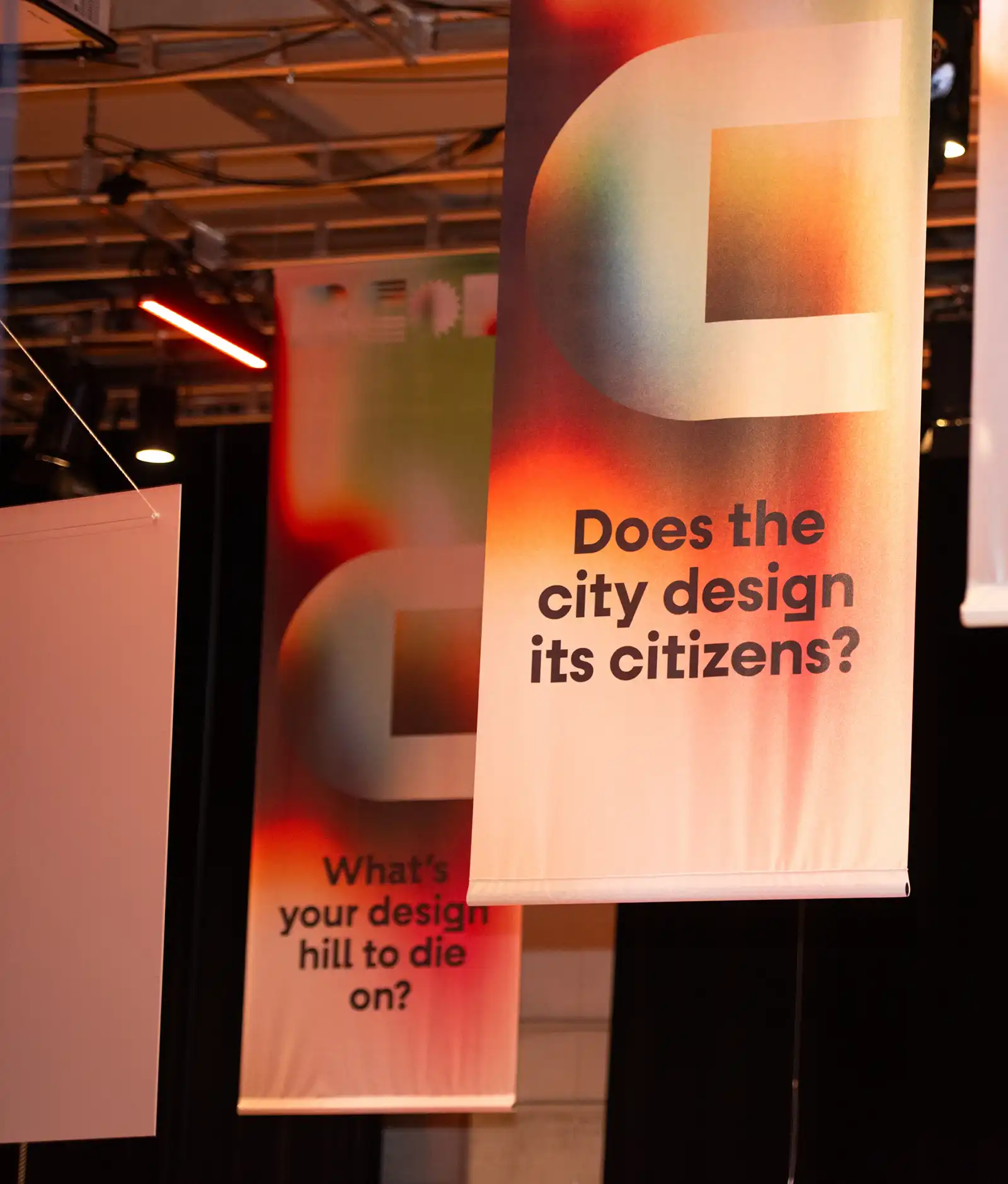
In addition to the visual identity, brot & salz has developed a spatial installation that visually fuses brand identity and architectural discourse. At the center of the room, the BCOD logo floats as an oversized, rotating mobile. The kinetic sculpture is surrounded by fabric banners whose text is specifically designed to spark discussion within the space. The result is a dynamic, immersive installation that connects brand identity with substantive exchange.
Thus, 20 years of UNESCO City of Design does not become a retrospective, but an identity in motion: visible in space, in the logo, in the color, and in every format that will yet emerge from it.