

The CI: Bolder, more vibrant, more colorful.
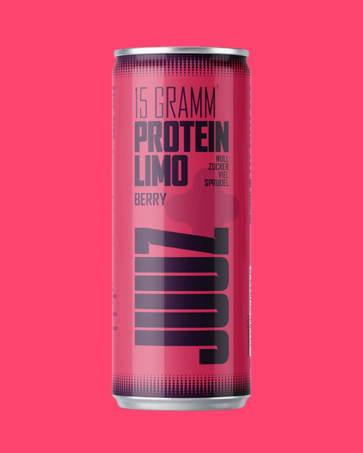
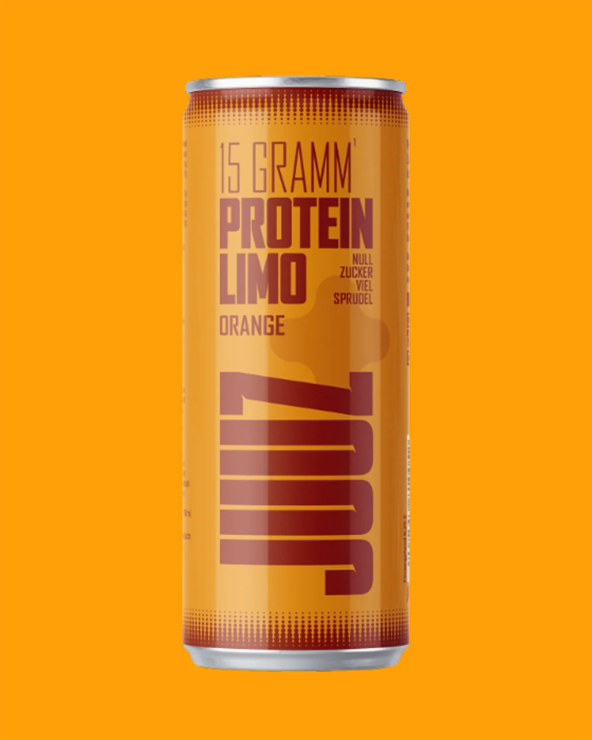
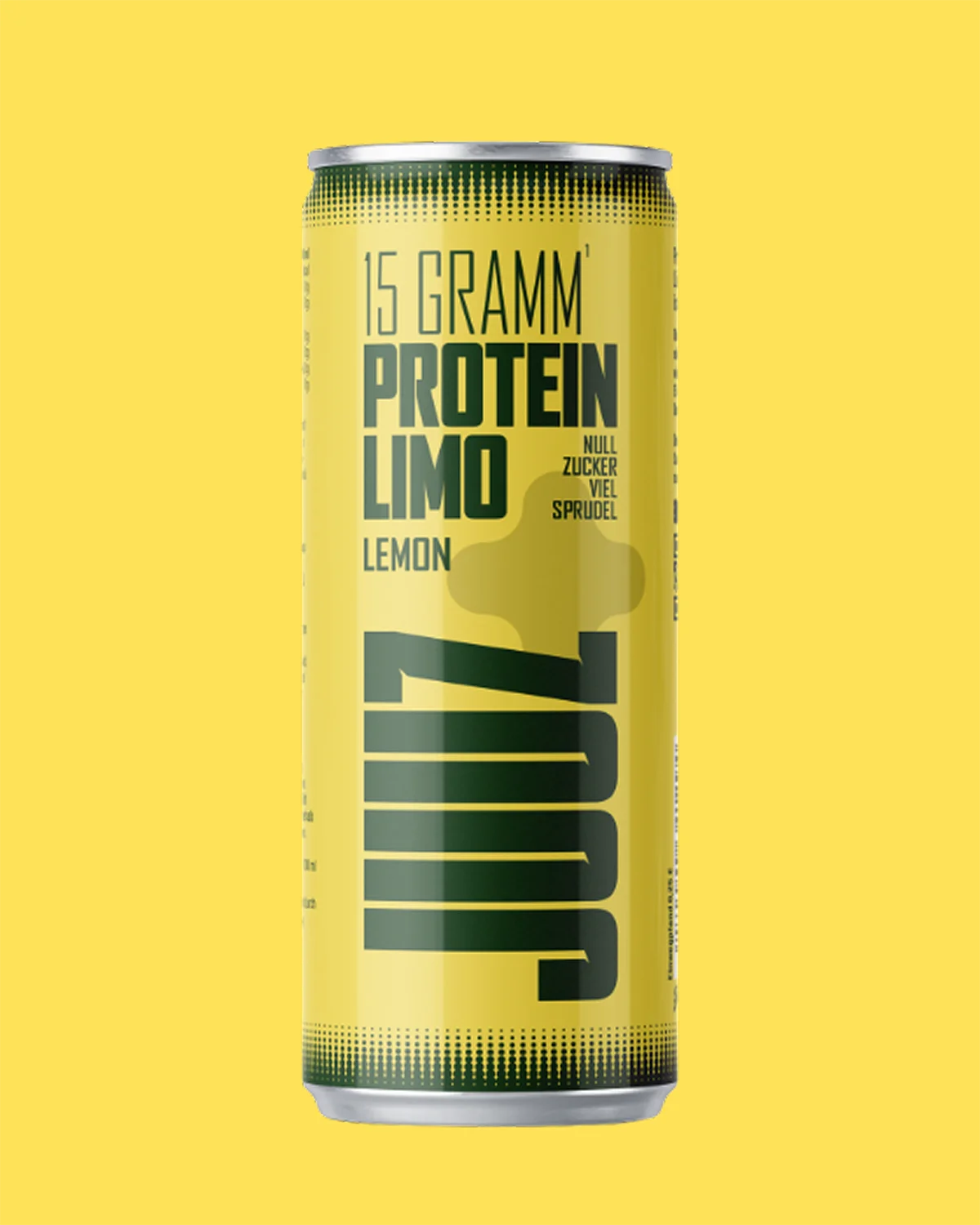
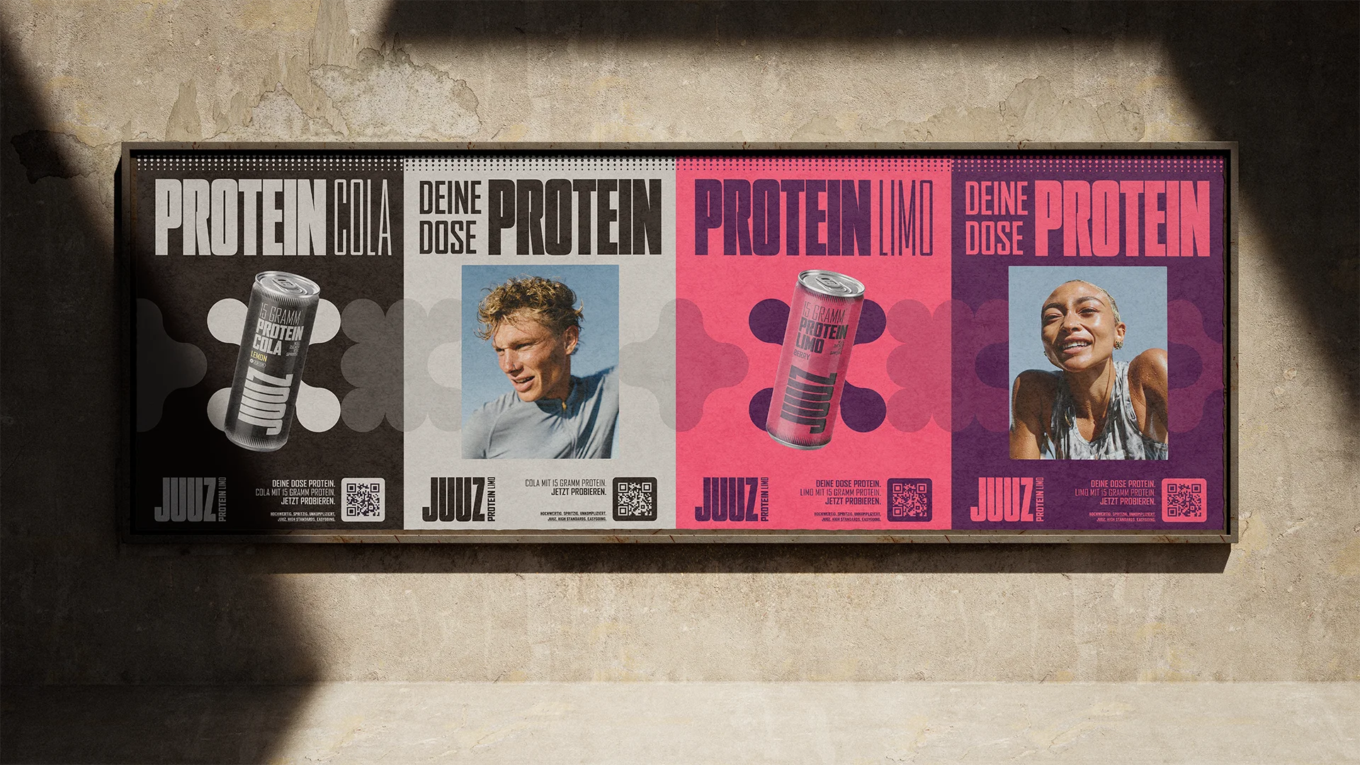
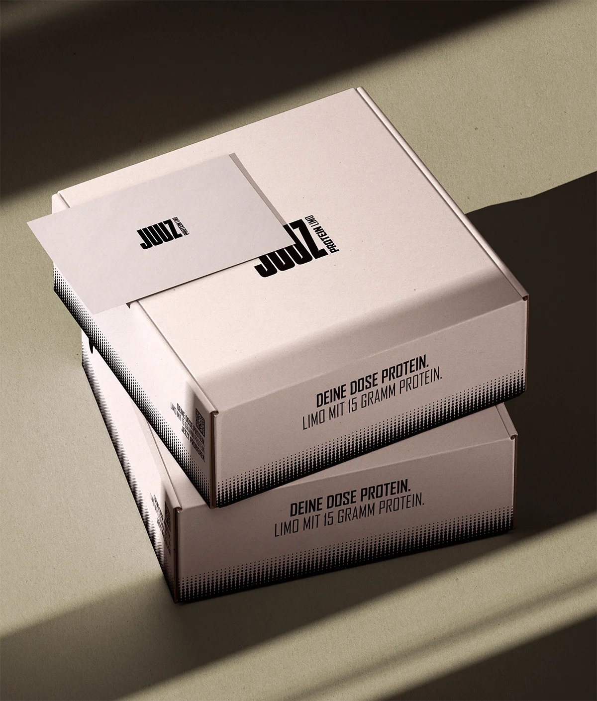
The new JUUZ logo stays true to its roots while becoming bolder, edgier, and more striking. Subtle cutouts in the wordmark give the letters more depth and lend the entire brand a more dynamic feel. This is especially noticeable on the can: Fonts and typefaces nestle against the curve of the product, literally growing out of it—a perfect match between form and brand. Subtle strips along the top and bottom edges frame the design and reflect what JUUZ is all about at its core: effervescence. And where the old cans were understated with white and a colorful stripe, the new color scheme brings the fun back to the shelf. Bold, vibrant hues make the product’s soda-like character immediately apparent. JUUZ now looks just as it tastes.
Up close with real
athletes.
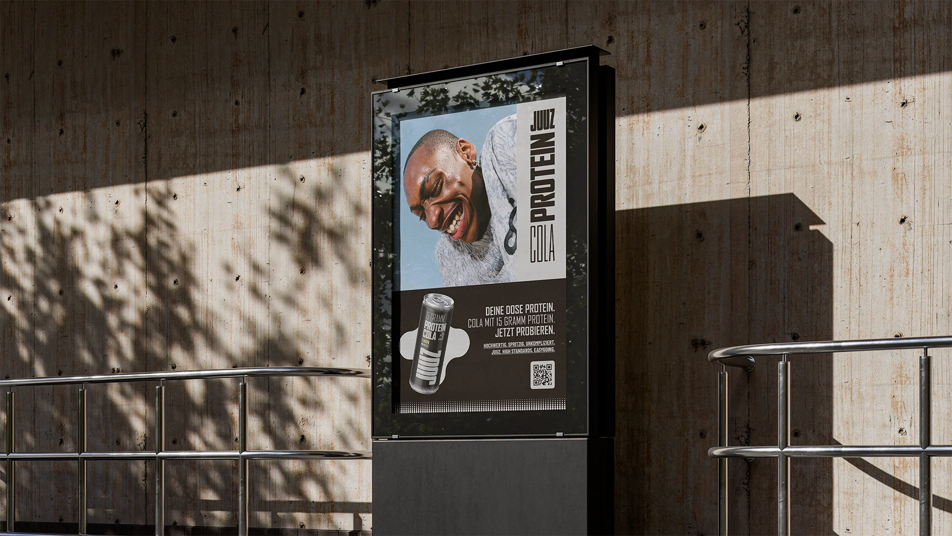
JUUZ captures its imagery right off the court, out of the ring, and on the mat. Athletes are shown at the exact moment that counts: right in the thick of it, giving it their all, or just after—just before they take a breather. In close-ups, we get so close that the human factor takes center stage. We show the faces of real people and genuine effort, but always the fun as well. Changing angles create dynamic scenes that work just as well on social media as they do on the can.


Conceptually, JUUZ is becoming more dynamic, bolder, and more joyful. The new tagline, „Deine Dose Protein“ (eng. Your can of protein) positions the brand exactly where it belongs: as THE can of protein on the market. And rightly so, because JUUZ is the very first protein soda in a can. And since nobody orders „soda“ around here, the product is now simply called what it is: soda.

The campaign
With the campaign hero film, brot & salz brings the JUUZ brand to life: authentic testimonials showcasing genuine, collaborative effort, fast cuts, interesting angles, and state-of-the-art cinematography. This is complemented by a powerful voiceover and the iconic, recurring element—the double “U”—which runs throughout the entire campaign in the form of headlines and speaks directly to the target audiences.
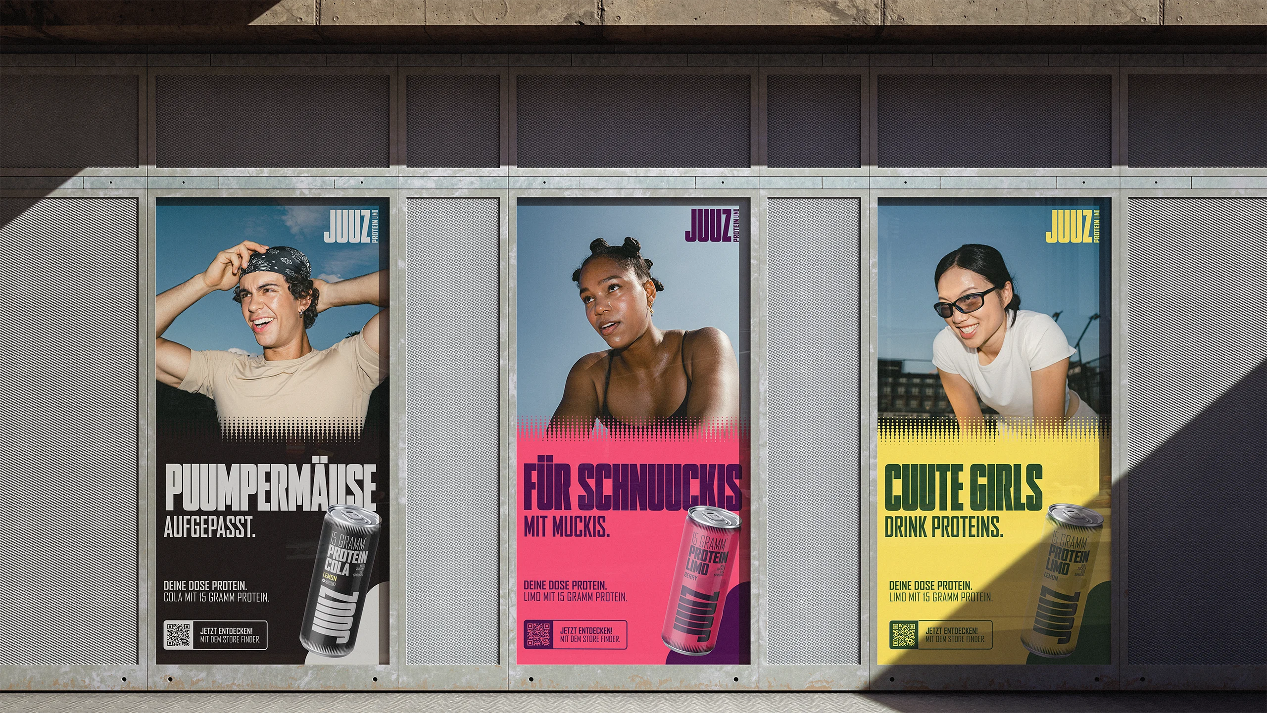



JUUZ on the radio: The double U becomes a linguistic element that can effectively use the brand without any visual elements at all. No matter what voice, no matter what place. JUUZ is included.