

The bridge between
Yesterday and tomorrow.
An important element of the entire rebranding effort is the manifesto film. It serves as an emotional thread that honors Dr. Strunz’s vision while boldly looking toward the future. It speaks a language that bridges generations: from tireless perseverance to the realization that true vitality is a holistic choice involving exercise, nutrition, and mindset.
Corporate design as a balancing act.
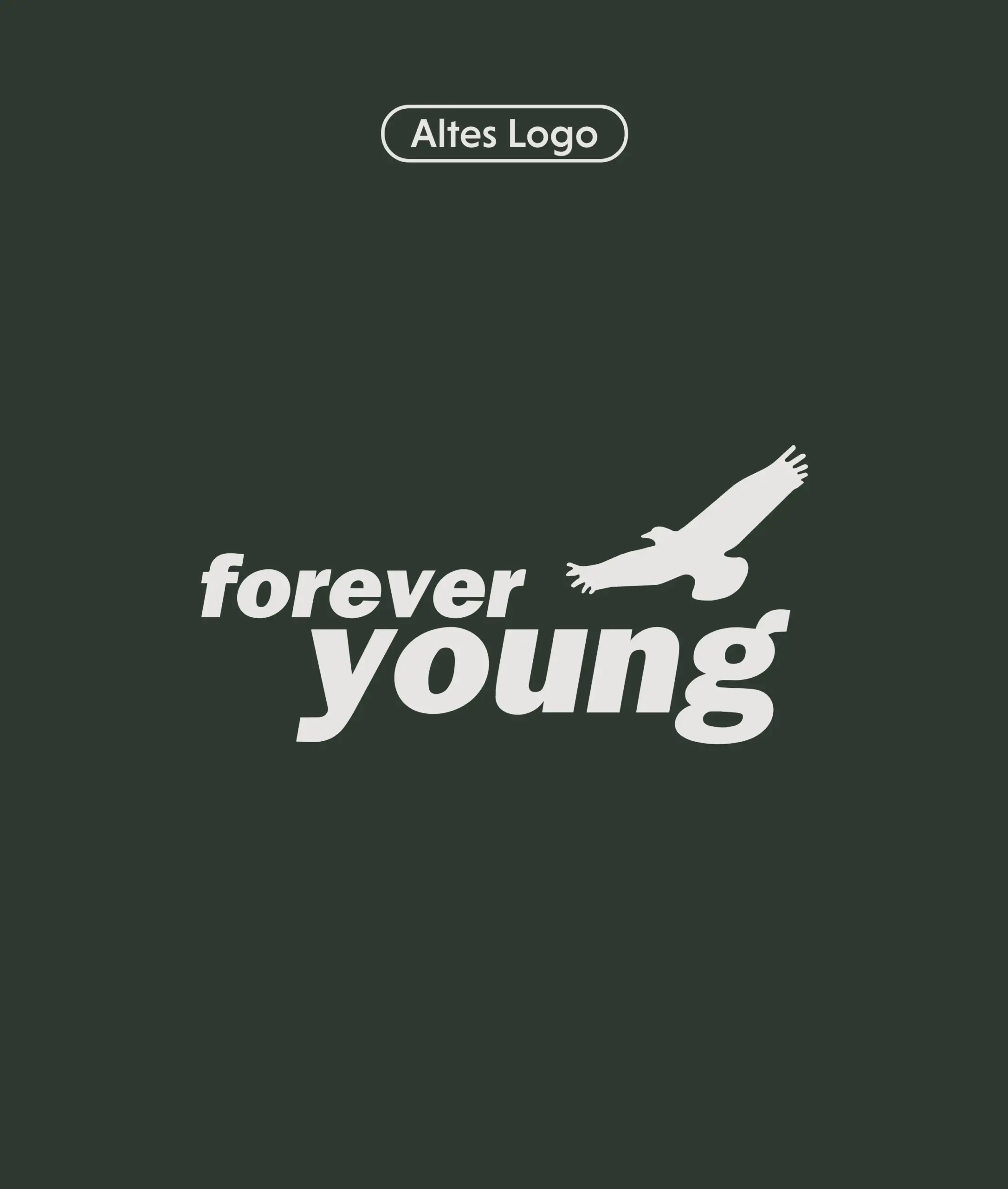
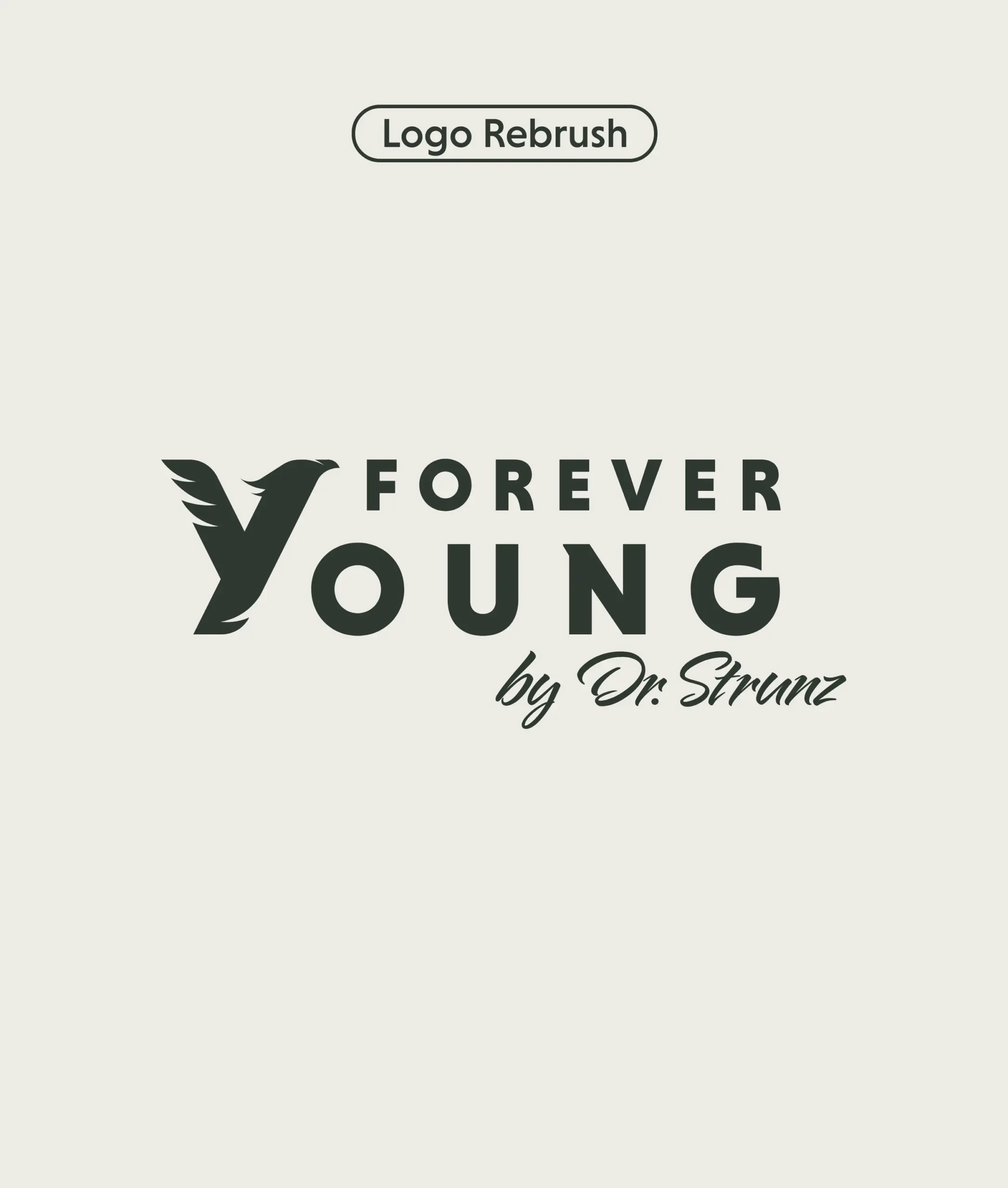
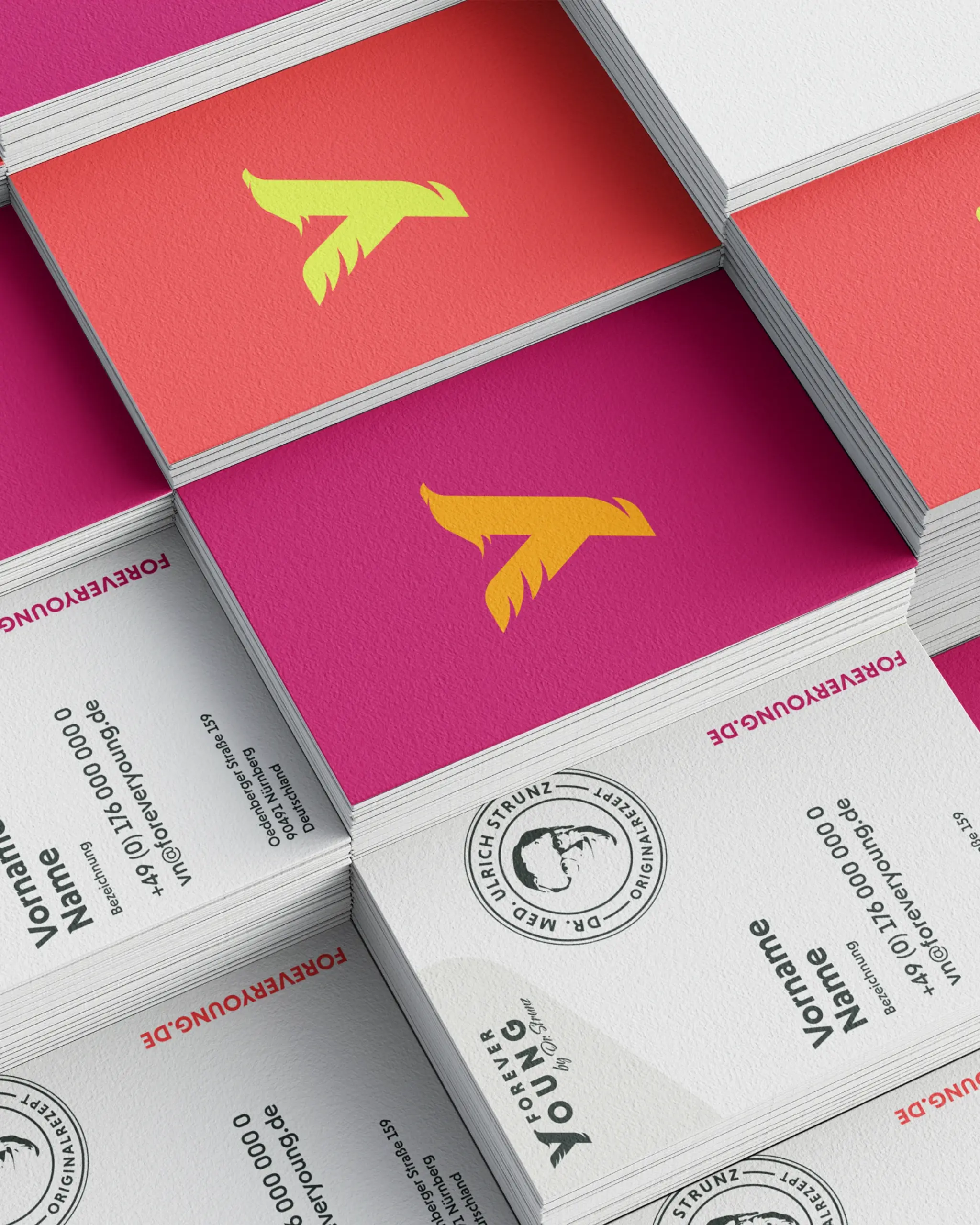
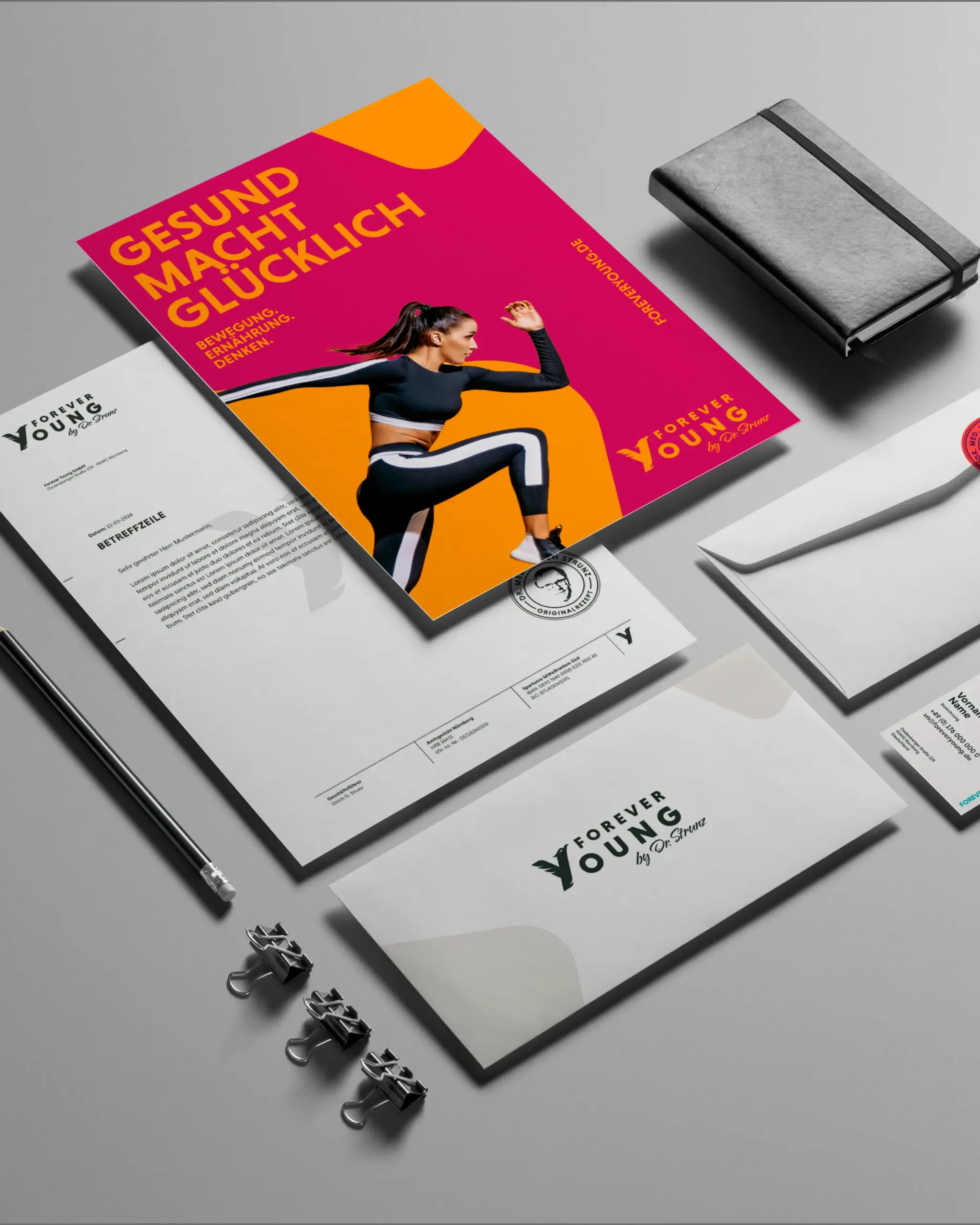
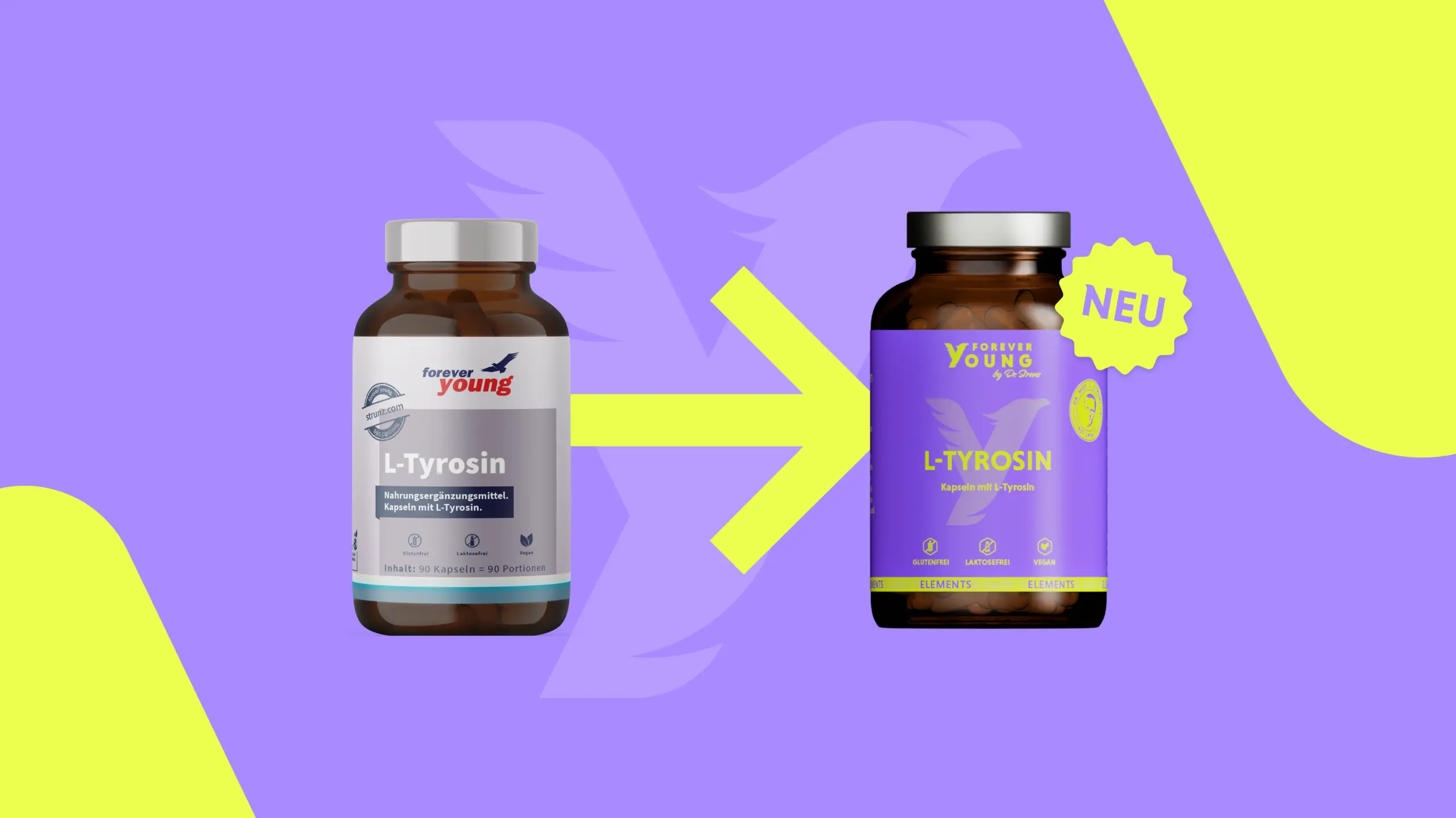
Two worlds, one design: We needed to create a visual identity that pays the tribute Dr. Ulrich Strunz’s legacy deserves, while at the same time being bold enough to build a brand for the coming decades. Not a compromise, but a synthesis of respect and a new beginning.
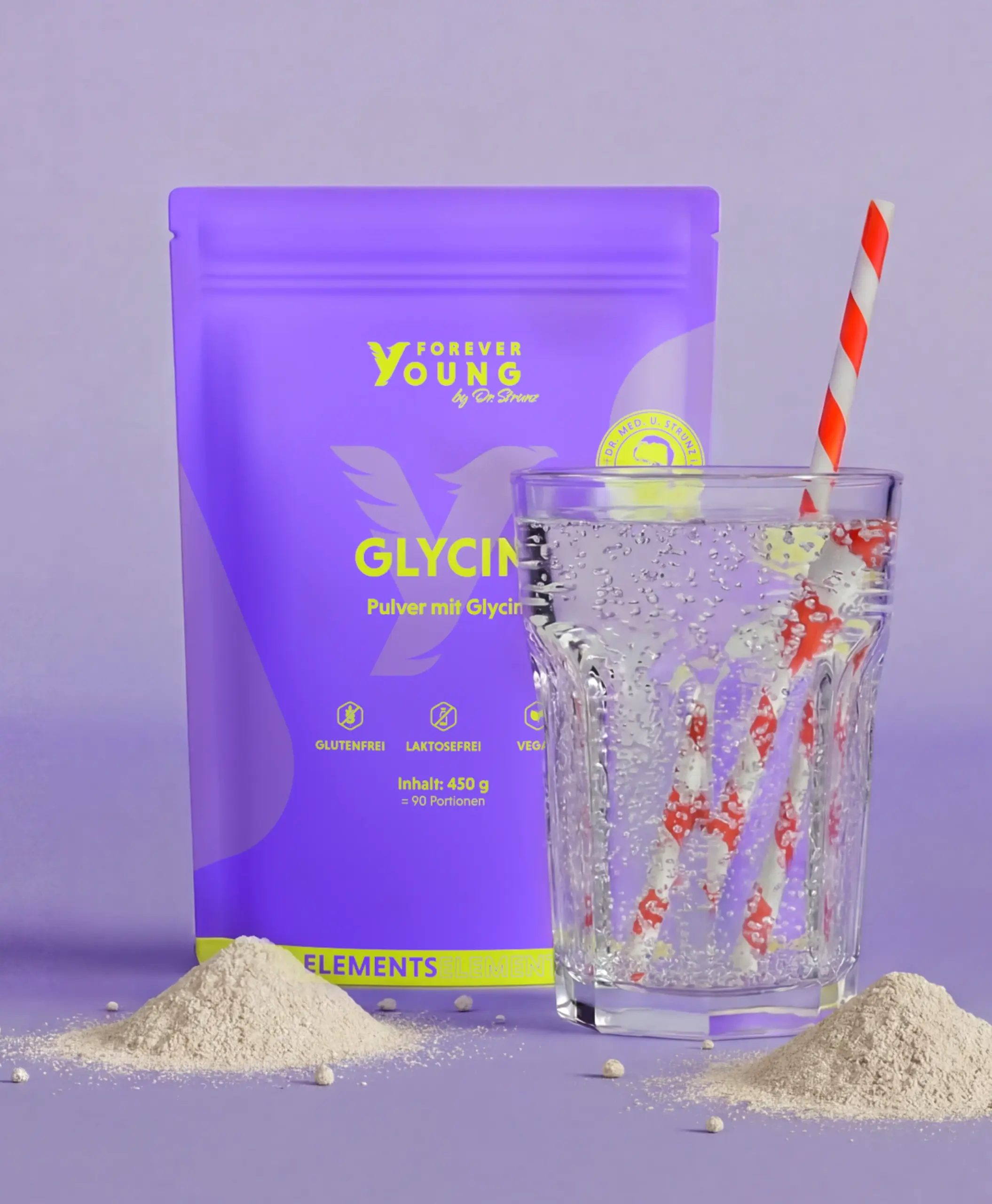
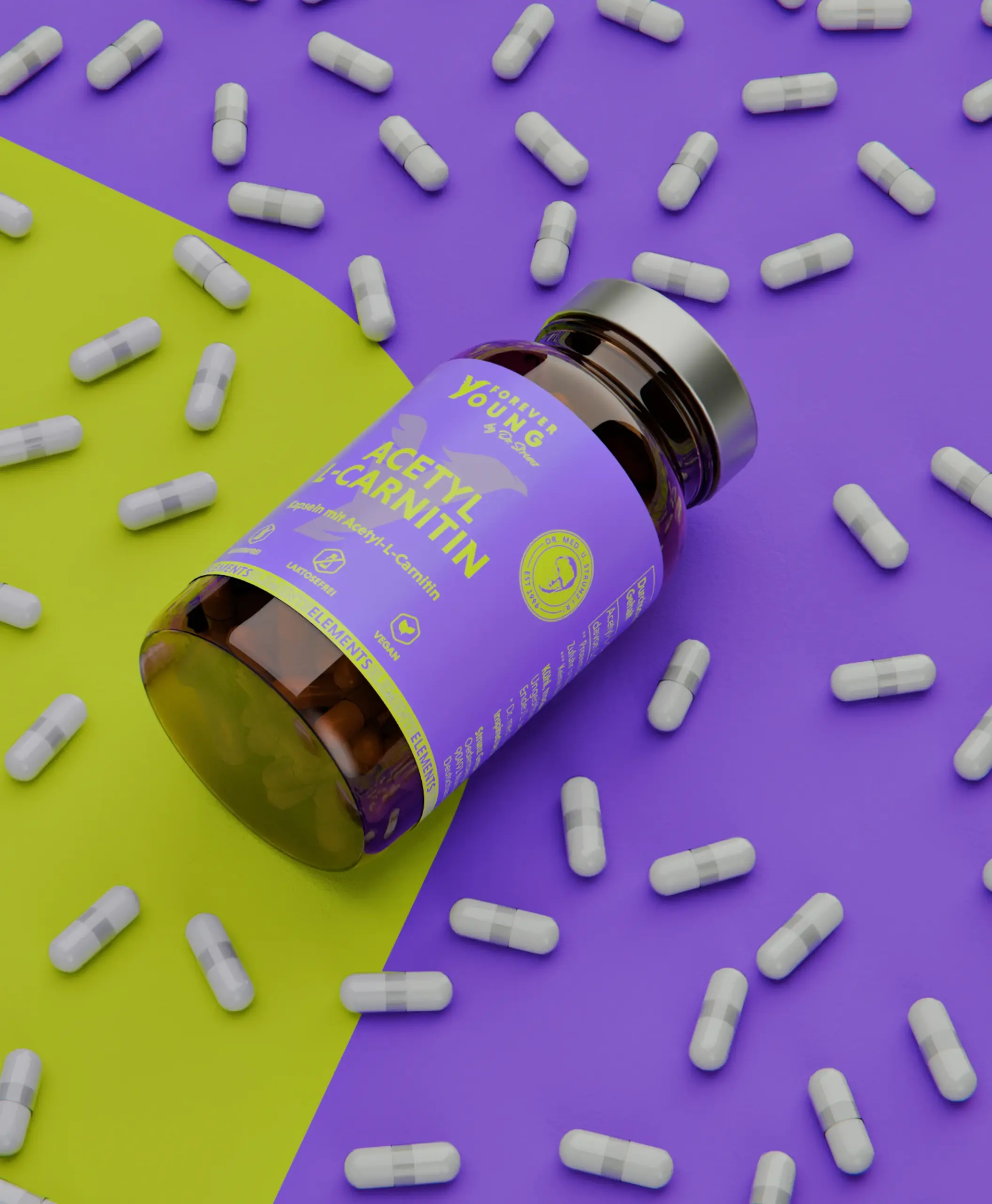
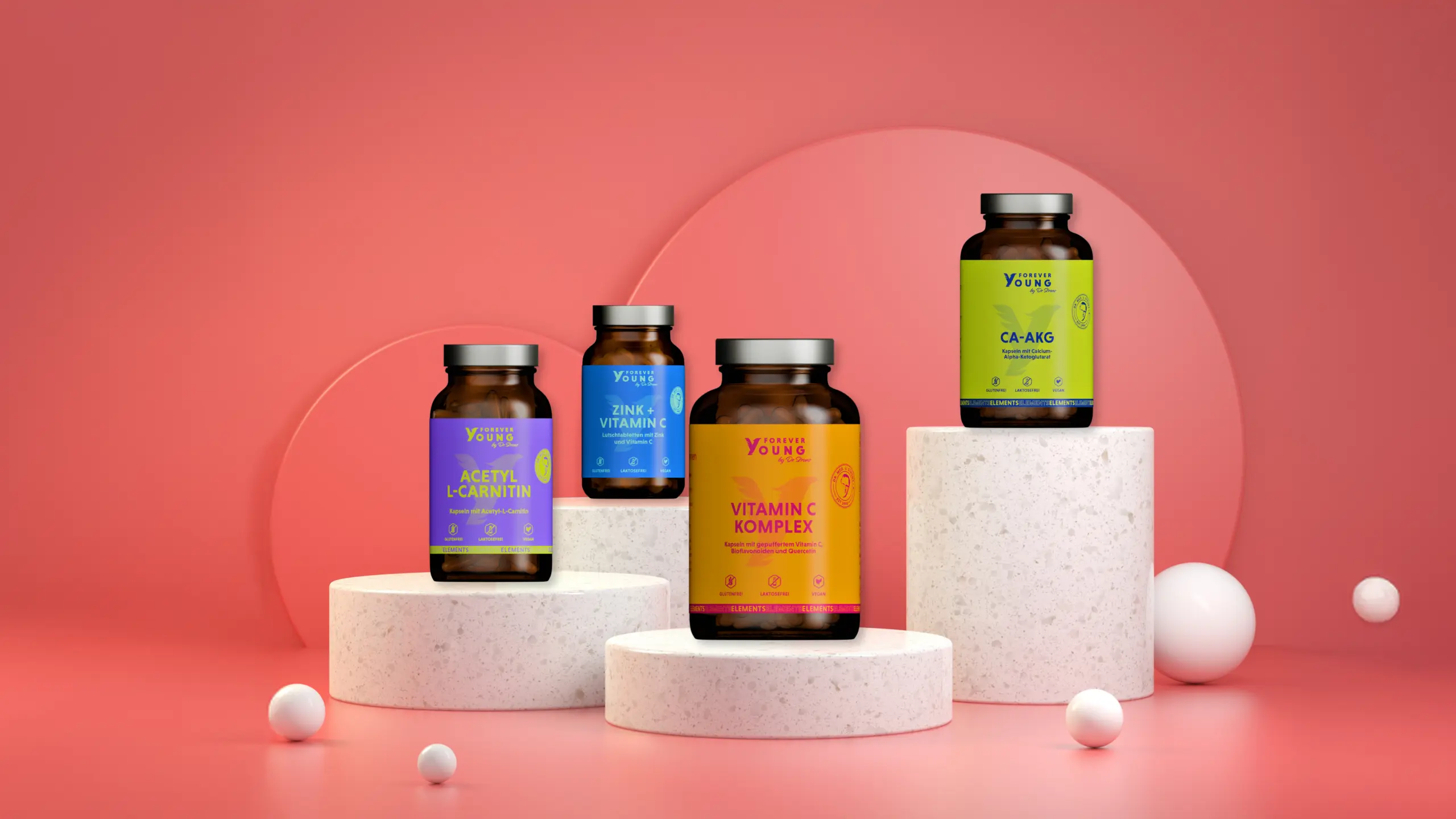
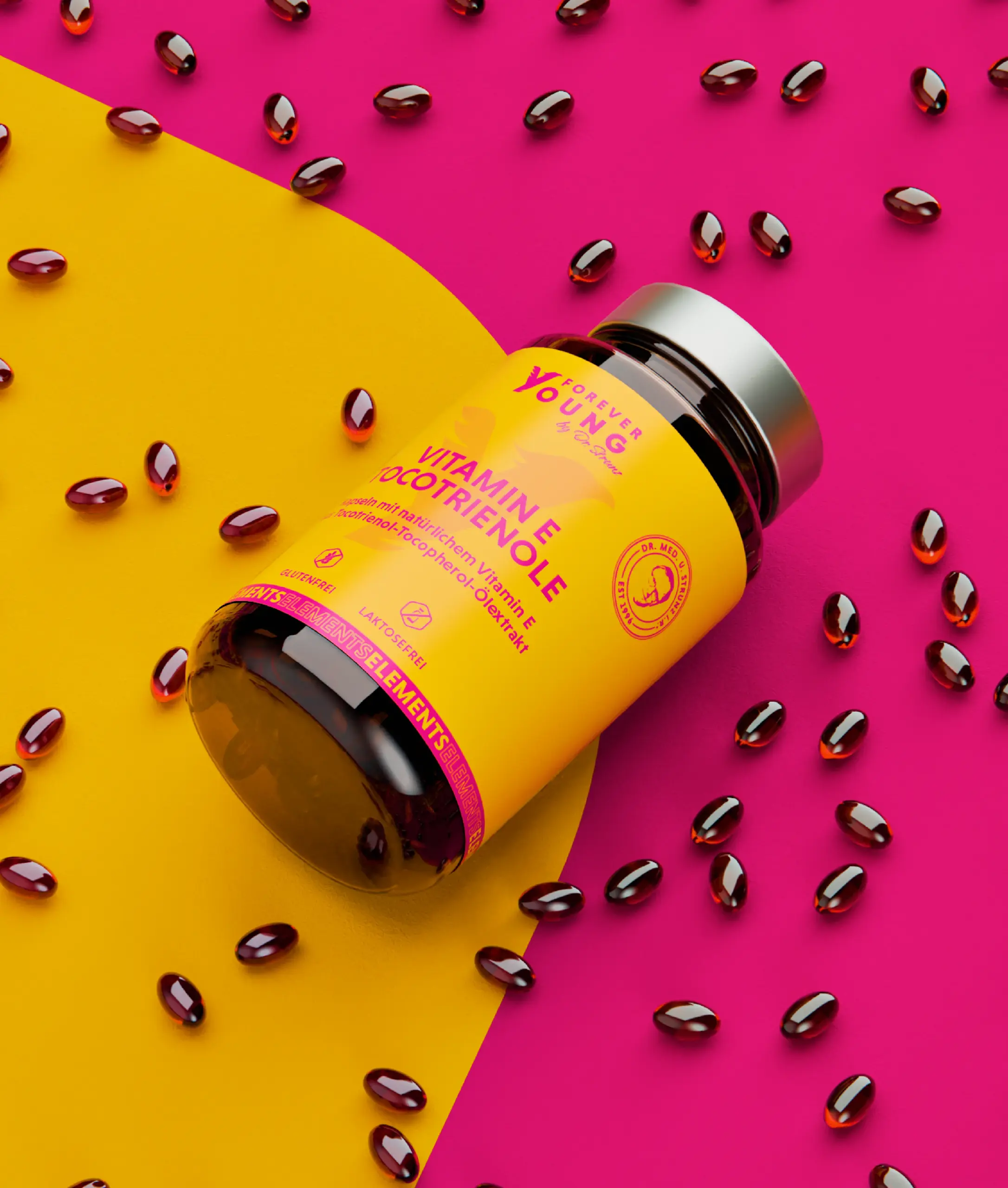
At its heart: a color palette as multifaceted as the product range itself—vibrant, fresh, and lively. Across hundreds of products, a cohesive system emerges that never feels diluted, but instead allows each individual product to find its own voice.

The Discrepancy Between Words and Images as a Source of Tension.
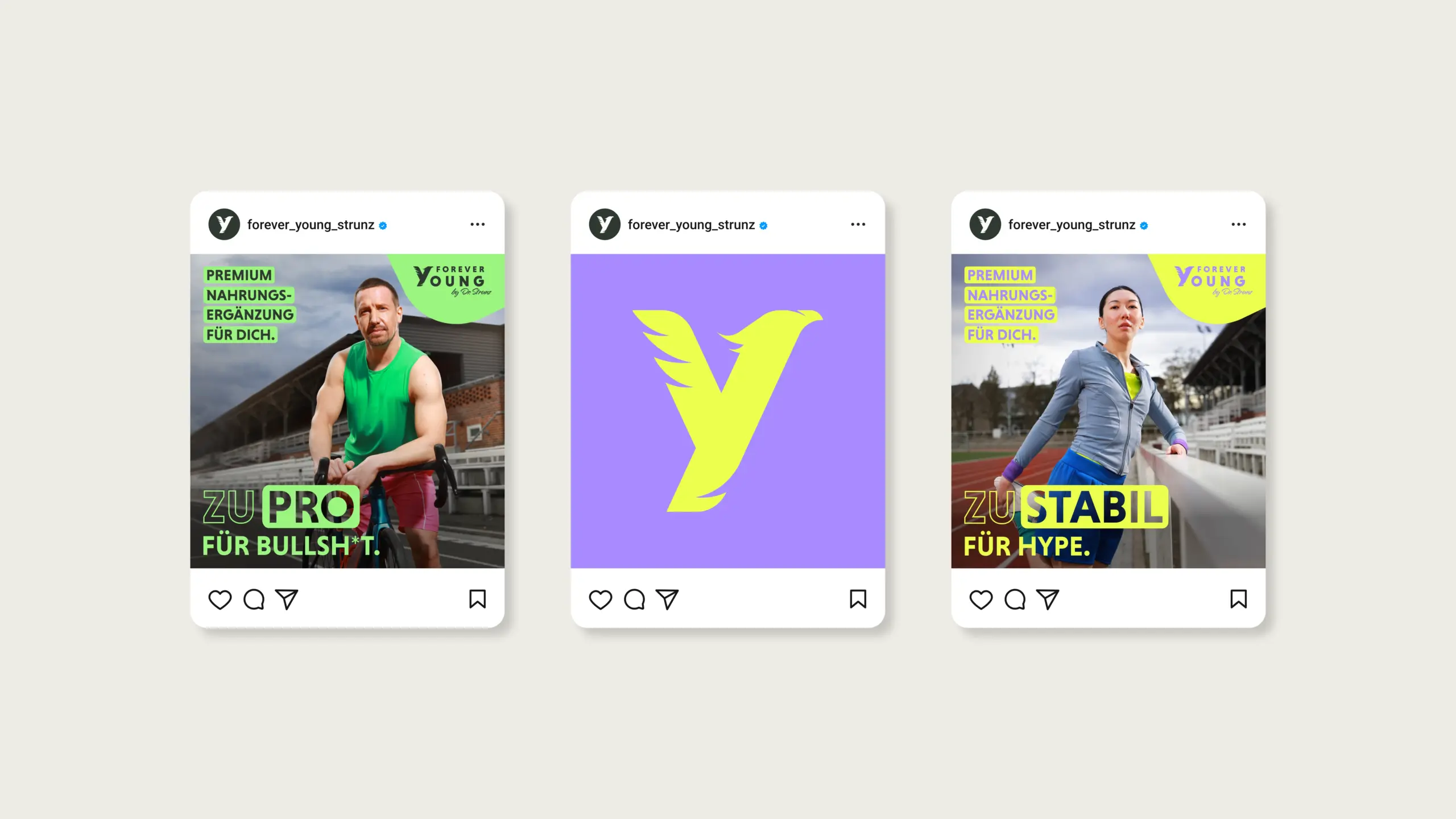
Instead of generic wellness imagery, our launch campaign focuses on an authentic visual language that interprets vitality as lifelong independence. The images capture moments of genuine energy and joy in life across all generations.
The strategic core lies in the tension between image and message. The headlines serve as powerful anchors that unambiguously convey the brand’s premium positioning.
An uncompromising stance. The clean, minimalist typography deliberately sets itself apart from the fast-paced market. It conveys expertise and confidence without coming across as loud. This contrast underscores the essence of Forever Young: a brand with too much substance to chase after short-term trends.
Premium quality as a deciding factor.
We’ve defined Forever Young as the brand for people who don’t take shortcuts. The core message of the campaign: „Premium nutritional supplements for you.“ This isn’t about short-term trends, but about a conscious lifestyle choice.