
From service provider to brand. Achsnick Pape Opp becomes Florett & Falke.
The new name follows a classic law-firm naming convention — with a twist that captures the firm’s essence: “Florett” — the blade of clarity, and “Falke” — a hawk’s sharp eye and holistic perspective, both vital in times of crisis. Together with the claim „Mit Klarheit aus der Krise“ („With clarity out of the crisis“) and a refined identity, this creates a cohesive brand presence that positions the firm as a reliable partner through corporate crises.


The new corporate design turns the brand identity into a visual language built on clarity and precision.
Typography, color palette, imagery, and refined graphic details create a cohesive look with strong recognizability. Design highlights include the new logo and key visual. The Florett & Falke Double-F becomes a distinctive monogram — uniting the falcon and a pair of crossed fencing foils — pared back, powerful, and richer in meaning than it first appears.


The new website anticipates your next step — and the one after. With Infinite Flow, content is seamlessly connected, so the path stays clear. Navigation is textbook-clear, guiding readers and inviting them to dive deeper. A digital experience that doesn’t ask for directions — it shows what matters.

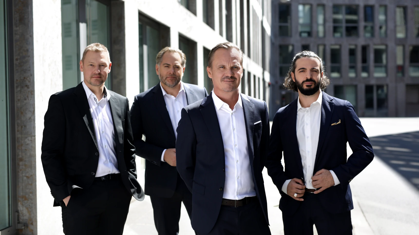
The new imagery brings empathy and decisiveness into balance. It shows the people behind Florett & Falke as they are — present, approachable, and communicative.
The result is a cohesive picture that makes professional expertise as visible as the human strength that turns Florett & Falke’s experts into a steady rock their clients can rely on.